Ubud
Branding
UK cosmetics brand
BRANDING | PACKAGING
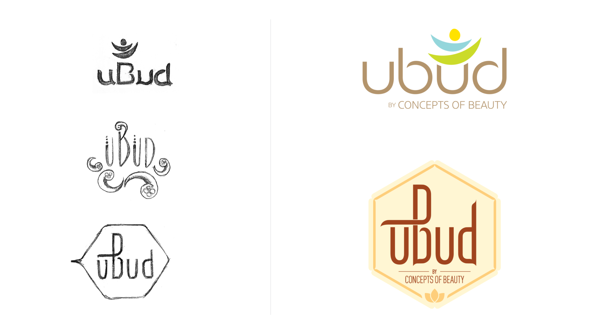
Another extension of the Asquan family of products, named after a tropical paradise, the Ubud products are meant to bring calm and serenity to your home. Taking cues from yoga, Buddhist and Hindu beliefs, nature, and beach culture, the team and I sketched over a hundred logo options ranging from clinical to rustic and religious.
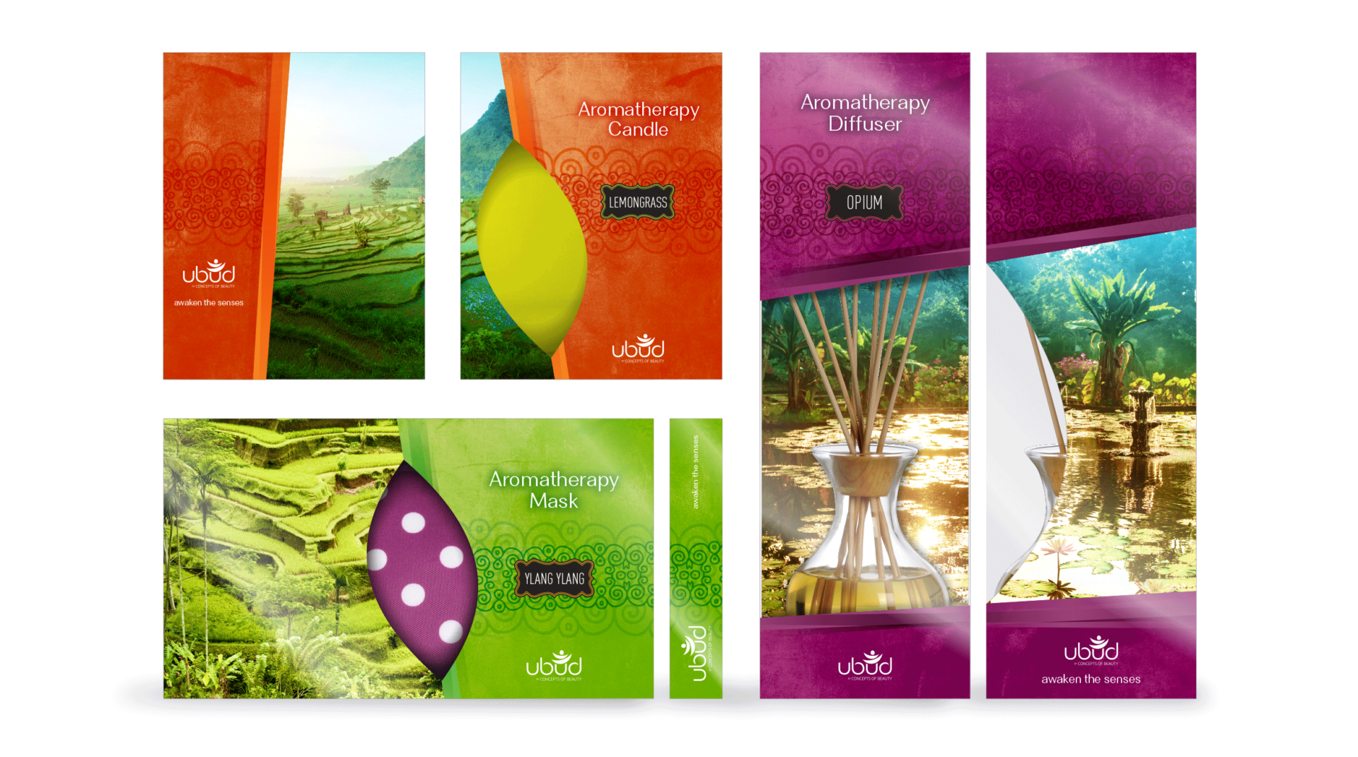
The mark, a figure in a yoga pose, also becomes a representation of lush jungles, blue oceans, and bright sun. The figure is supported by a thin logotype that tapers to mirror the figure’s arms and legs. Signifying freedom of mind and body, the counters of the ‘b’ and ‘d’ remain open. The packaging’s exotic colors, rich textures, and photos of Ubud’s luscious landscapes combine to sweep the consumer off to an exotic getaway.


