Beech-Nut
Branding, Landing
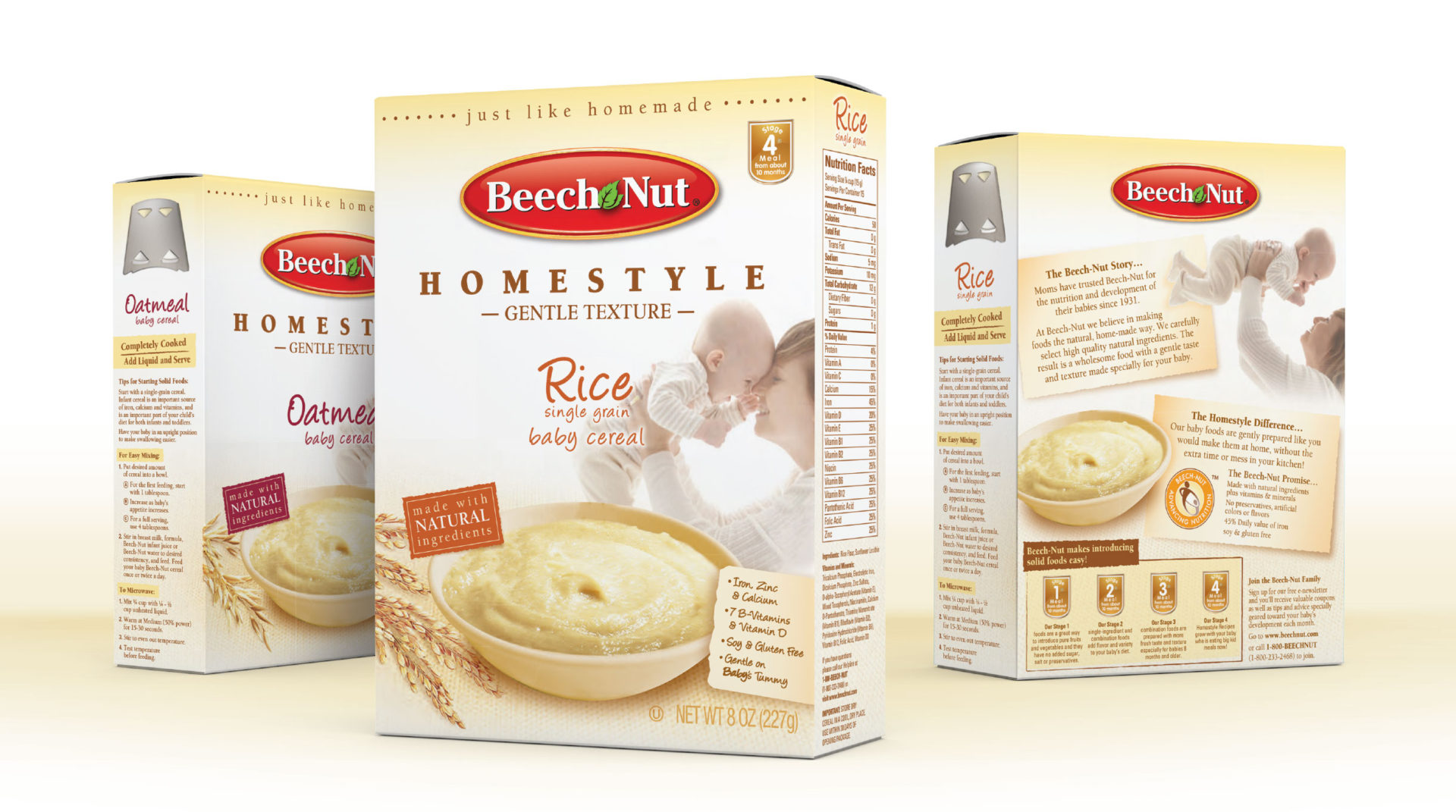
Beech-Nut dry cereal packaging
PACKAGING REFRESH
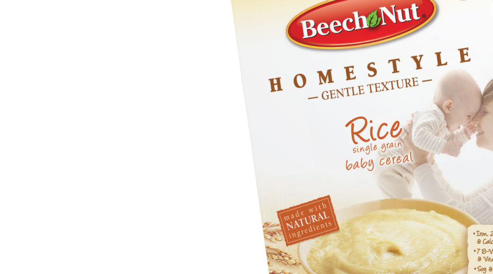
Beech-Nut’s color stripes had come to the end of their shelf-life and needed a refresh. While the design offered a bold and impactful presence on-shelf, it was having trouble competing with the softer, more lifestyle-driven Gerber and Plum brands. In-store category research yielded clear points the brand needed to hit to attract consumers away from the competition. First, the addition of ‘Homestyle’ and ‘All-Natural’ monikers gave the cereal a more friendly and approachable personality. With health and nutrition lifestyle on the rise, this was especially important. Secondly, the loving interaction between mother and child needed to be a primary focus. A warm sunlight yellow serves as a background for a mother and child in a loving embrace. This imagery transports the consumer to the special moments of joy she shares with her children and creates an emotional tie to the product.


