Concepts
of Beauty
Branding
Concepts of Beauty make-up and body
products for European market
BRANDING | PACKAGING
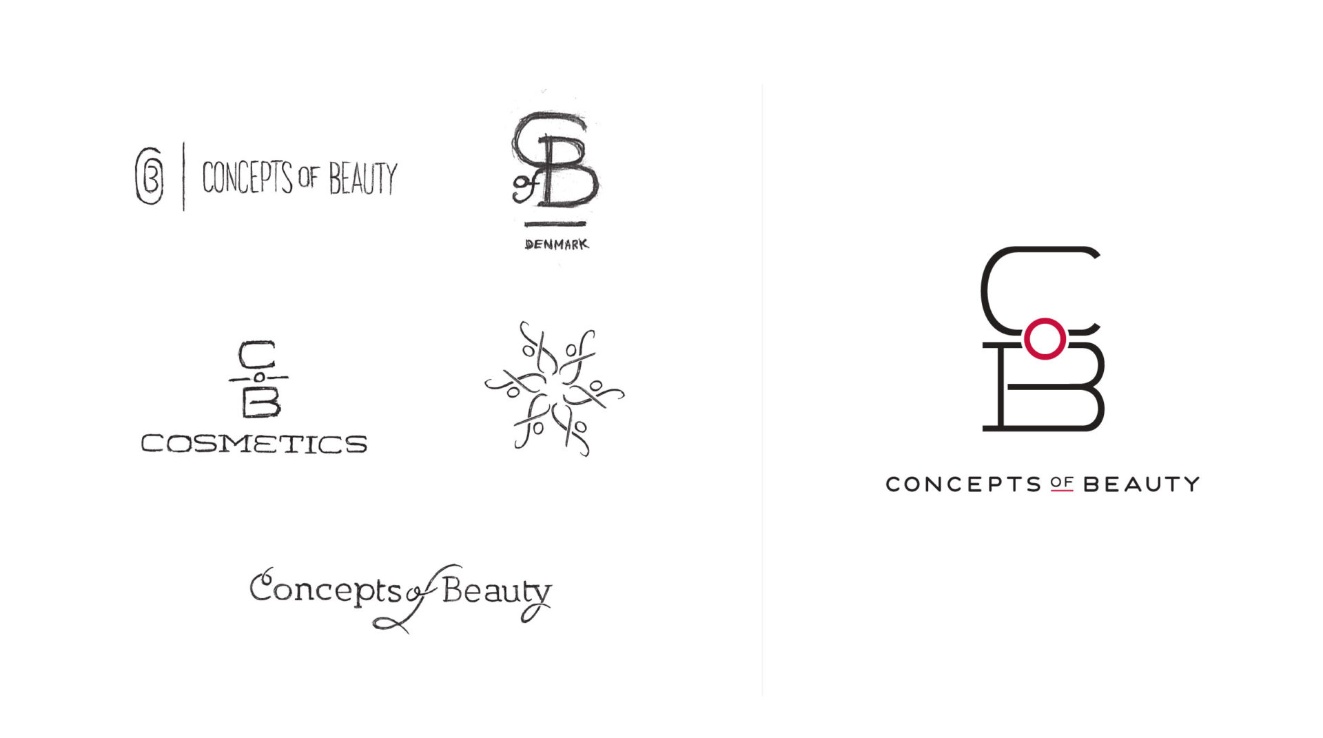
The Asquan Group brought to my team the challenge of creating a logo and packaging for their new Concepts of Beauty line. The client’s brief positioned this line at mid-level to be sold primarily in the UK. We were encouraged to find inspiration in brands like Apple and other high-end luxury brands, providing a clear focus in designing the logo. The logo would need to be versatile for use on a range of product sizes and applications. It was also decided the logo would require a monogram-type mark to be used when the full name wouldn’t fit. After exploring over a hundred logo options, it was decided my stacked monogram concept was best suited to represent the brand. A modern, extended, and serifed font was chosen for its even weight and bold character, giving the brand an air of dependability and consistency. The medium grey ‘C’ and ‘B’ are brought to life by a splash of red in the form of the ‘o’, representing the colors COB products bring to your life and skin.
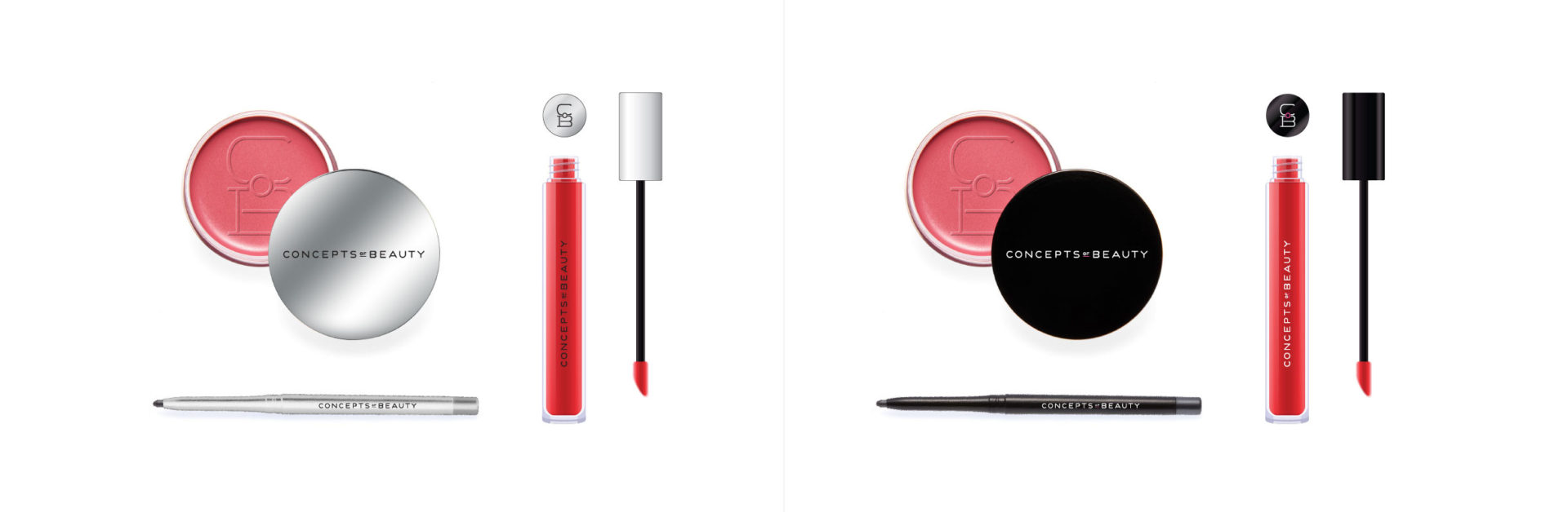
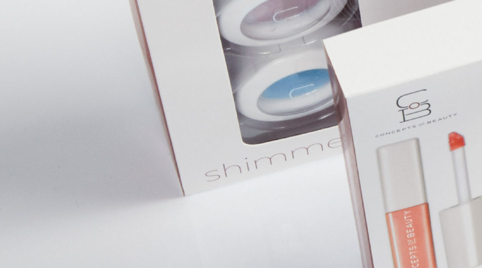
Varying from product-focus to glamour model photography, the team explored varying approaches to the packaging design. It was later learned that most package structures would have windows displaying the products, removing the need for product-specific photography. This opened an opportunity for a bold application of the logo and a clear description of the products inside. A tone-on-tone monogram pattern was designed for use as an accent on secondary panels. The final design allows the unique palettes of color to speak for themselves, completing an eye-catching presence on-shelf.