Giant
Branding, Landing
Giant and Liv cycling brands
PACKAGING REFRESH | STYLE GUIDE
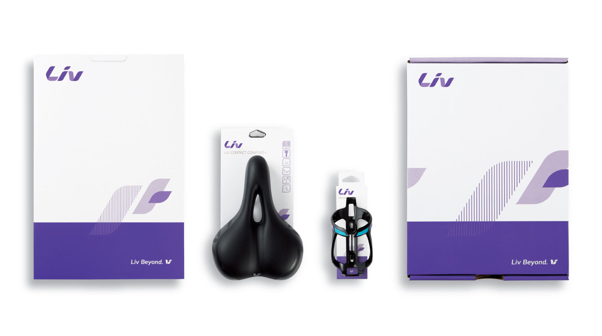
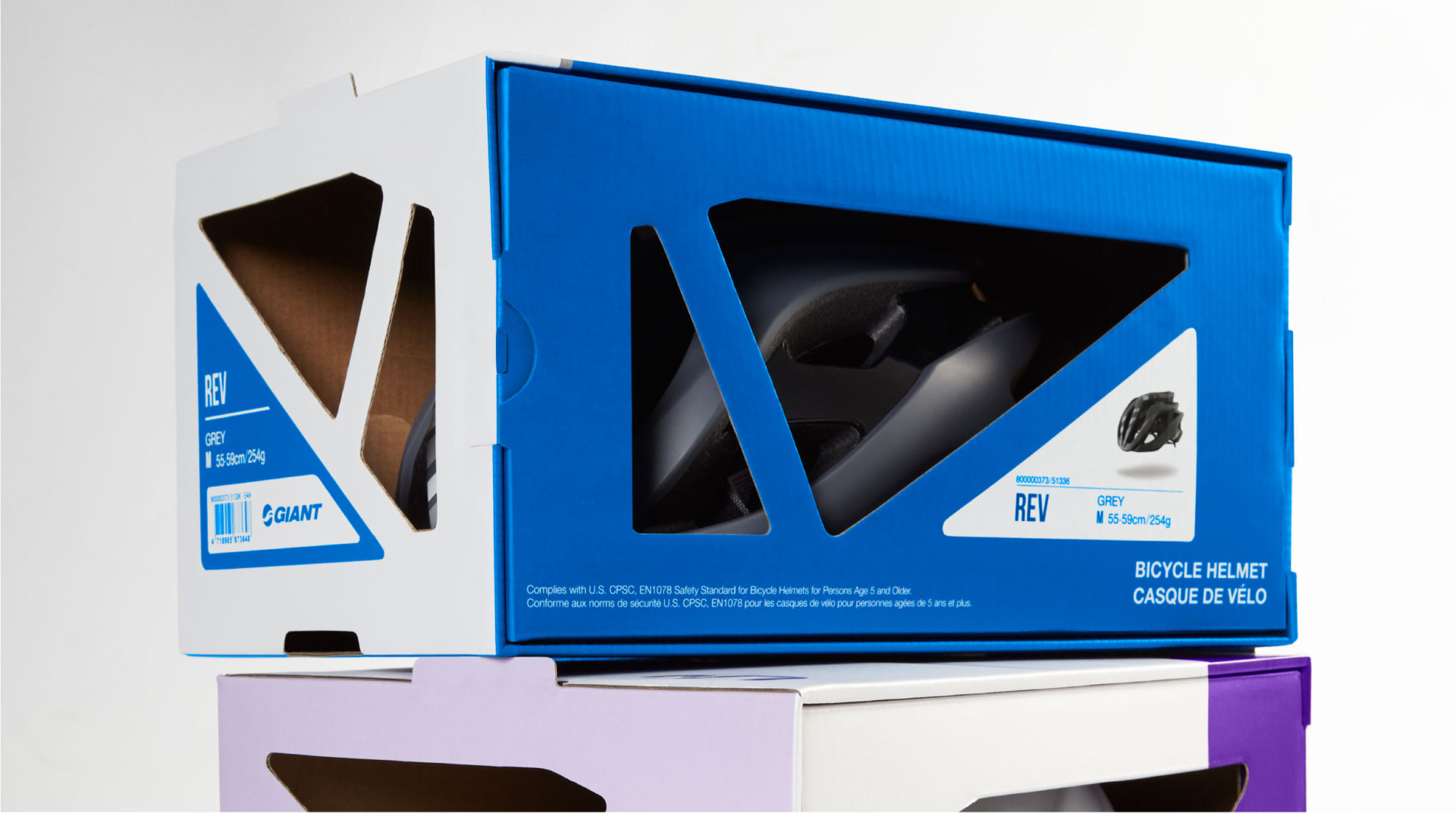
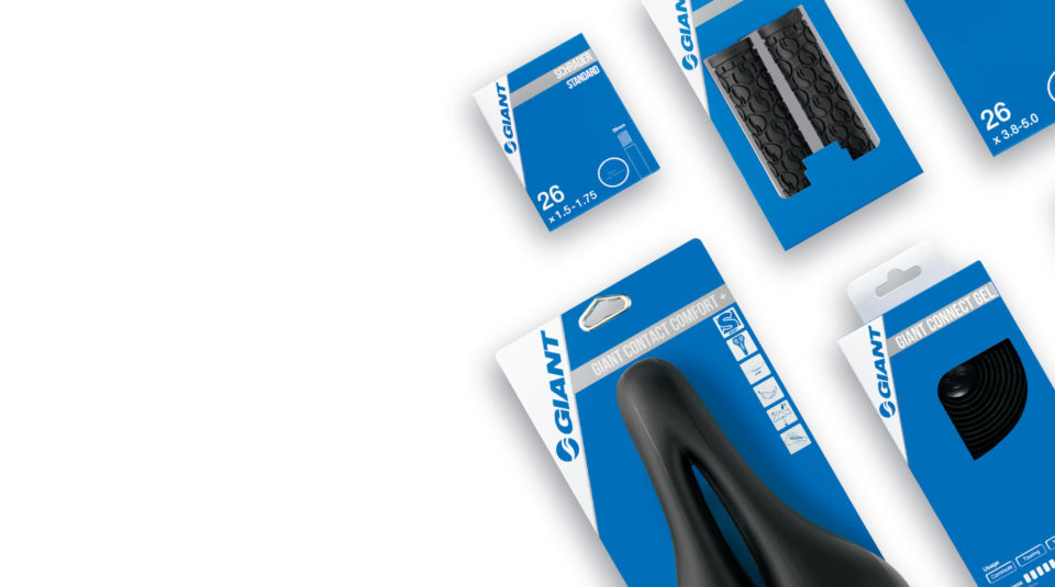
Giant lost control of on-shelf consistency for its men’s and women’s cycling brands, despite a hefty tome of brand guidelines, so they contacted me for help. My team’s first order of business was an in-store analysis of their current range of products and packaging types. Although the logo was very prominently-sized, it often lacked consistent placement. At times the product was obscured, especially on hang cards, which make up about 80% of their packaging. Our recommendation was to decrease the logo size, increase the rotation axis, add a silver stripe to underline the brand, and create a standardized location for product features. The problem of visibility was solved and created the secondary benefit of making the packaging more dynamic. For the sister brand, Liv, we carried out a similar exploration. The updates both proved successful on-shelf. The updated brand guides, both less than five pages, gave them a more straight-forward and concise way to control their brand.


