Havik
Branding, Landing
Sports Authority private label team sports brand
NAMING | BRANDING | PACKAGING
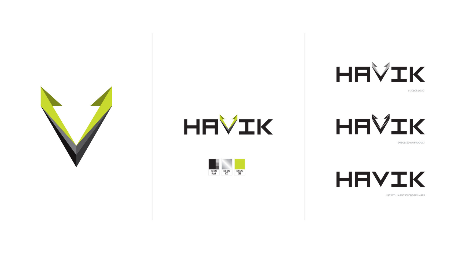
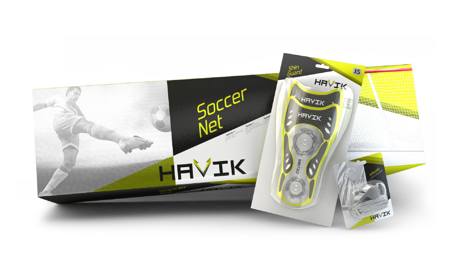
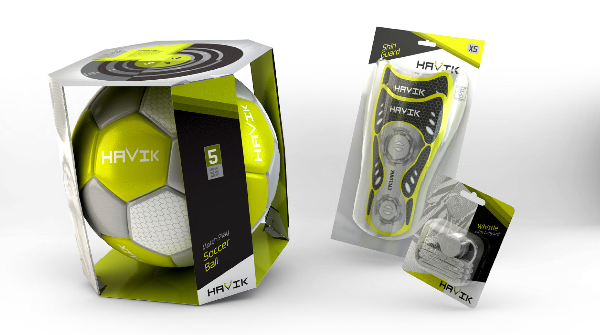
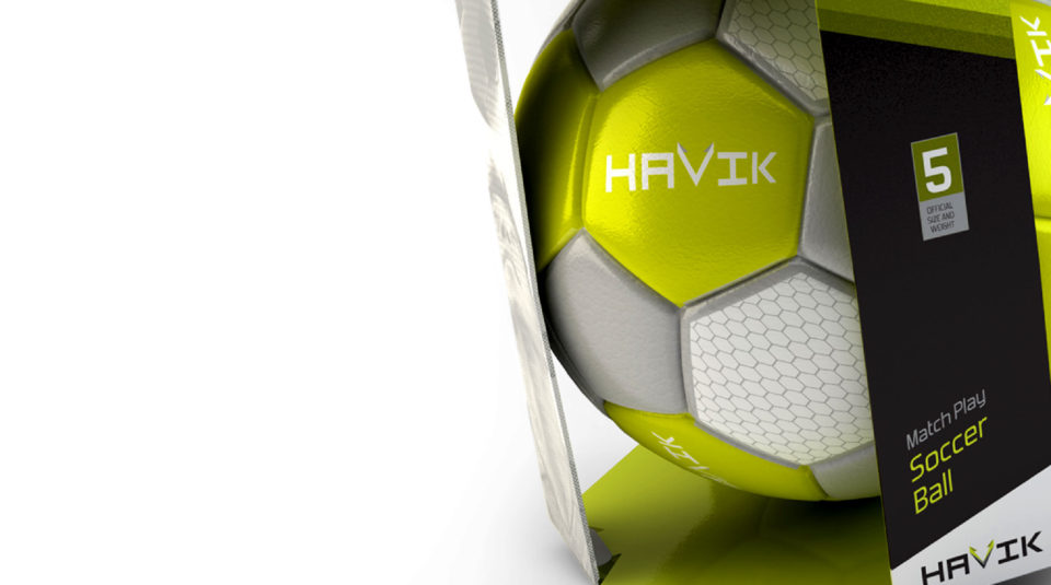
Sports Authority wanted a private label answer to team sports heavy-hitters such as Nike and Adidas. After rigorous naming exploration Havik emerged the champion. The essence of team sports is to push your way over and through your opponent toward victory. Likewise, the ‘V’ became an arrow driving its way unflinchingly toward the target, wreaking havoc where it strikes. Inspired by this arrow shape, the packaging’s geometry, created using an askew grid highlighted by halftone photography and an aggressive acid green, hits the field like a competitor, worn from the fight, with a razor-sharp edge over the opponent.
