Poise
Branding
Kimberly-Clark Poise Brand Refresh
BRAND REFRESH | PACKAGING REFRESH
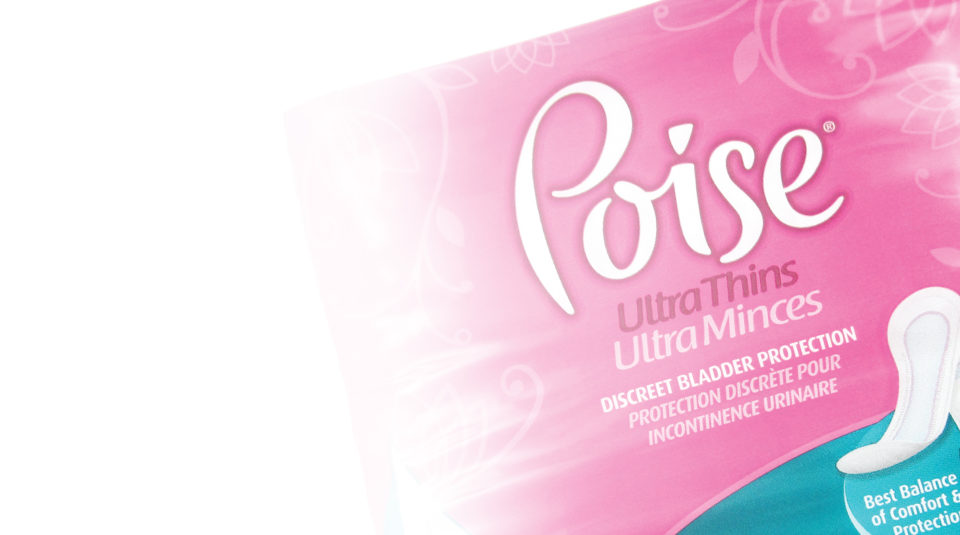
Kimberly-Clark needed to shift the consumers’ perception of their Poise products. Commonly mistaken as a product for the elderly, the product lacked its key target of middle-aged women. As a team, our goal was to create a brand look more capable of blending into the less embarrassing segment of other ’more normal’ feminine hygiene products just down the aisle. By removing the stigma perceived by consumers, the brand could become more accessible to women of all ages.
I first refreshed the logo to give the brand a more feminine and playful foundation. Replaced by a soft pink tone with a decorative floral pattern, the dated and recessive deep rose color was retired. A product segmentation using bold color cues in softly overlapping arcs fashioned after the petals of a flower, a soft, rounded font, and loose grid structure completed the new brand‘s new, softer look.

