Skittles
Branding, Landing
Skittles branding and packaging refresh
LOGO REFRESH | PACKAGING REFRESH | ILLUSTRATION
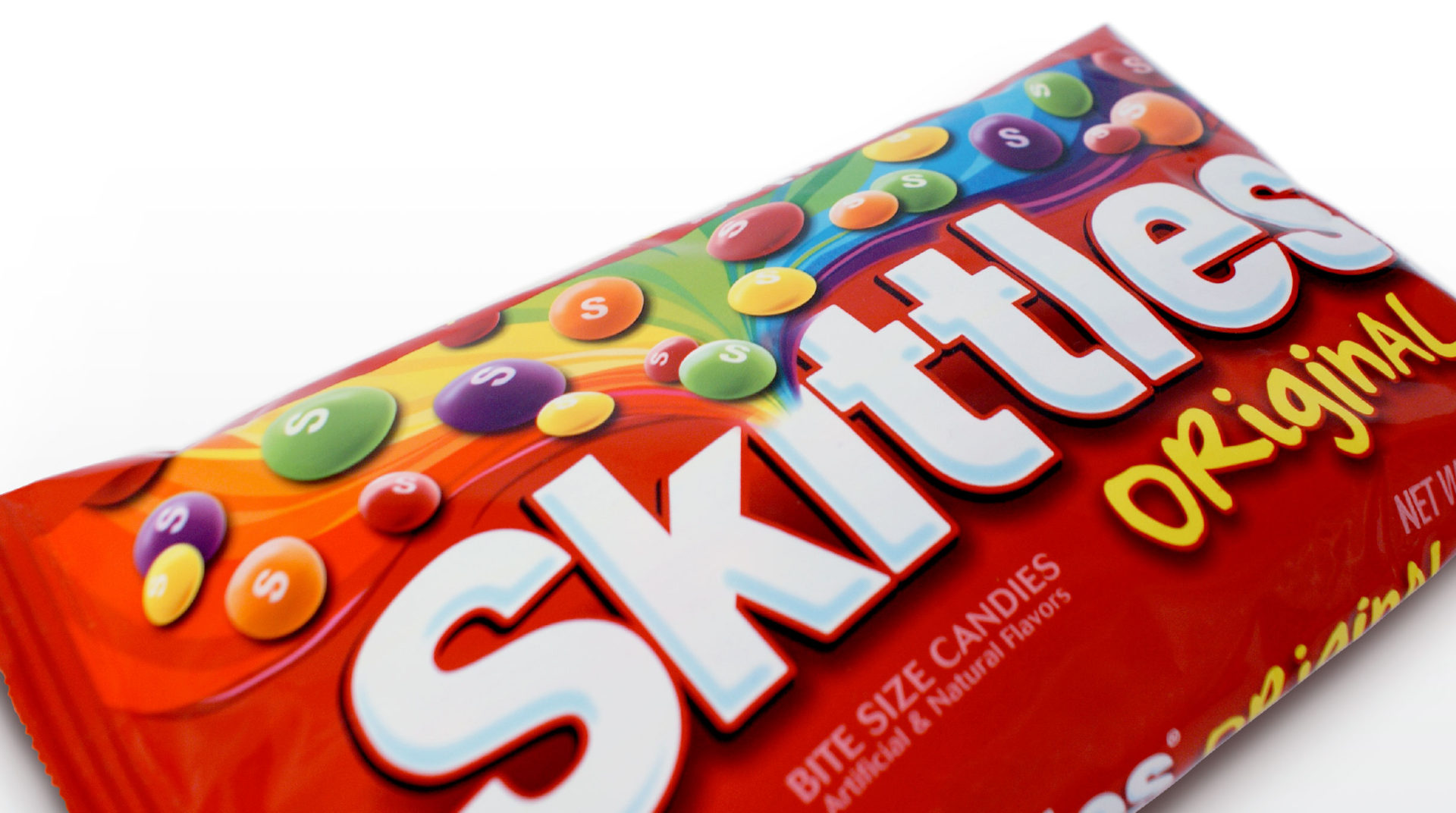
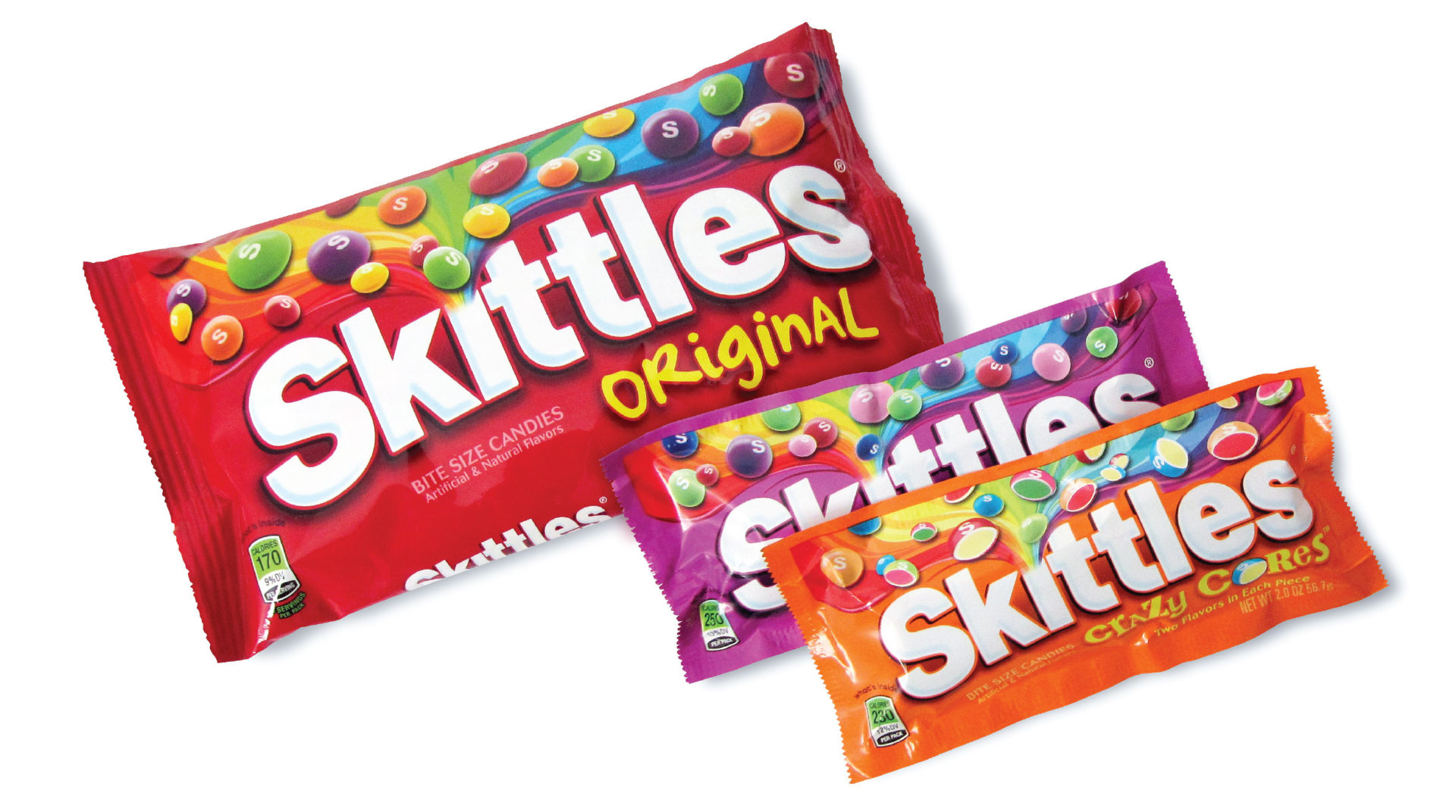
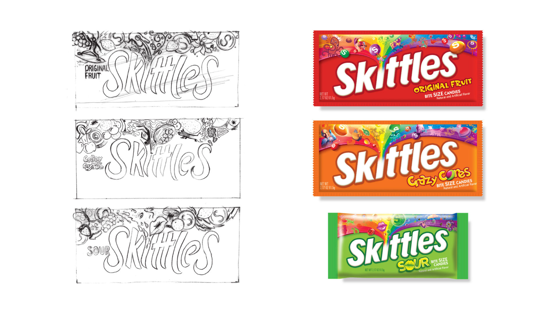
In preparation for a roll-out of new flavors, Skittles decided their packaging needed a facelift. Additionally, they wanted a closer visual tie to their ‘Taste the Rainbow’ campaign. The zany, and at times just plain weird, campaign made an excellent creative foundation. After developing crazy concepts exploring what a rainbow might taste like, the client chose a less psychedelic direction with the rainbow bursting from the logo in a shower of candy. Disappointing as it was that the crazy characters never came to life, the results were still very impactful on-shelf, bringing new life to the rainbow.


